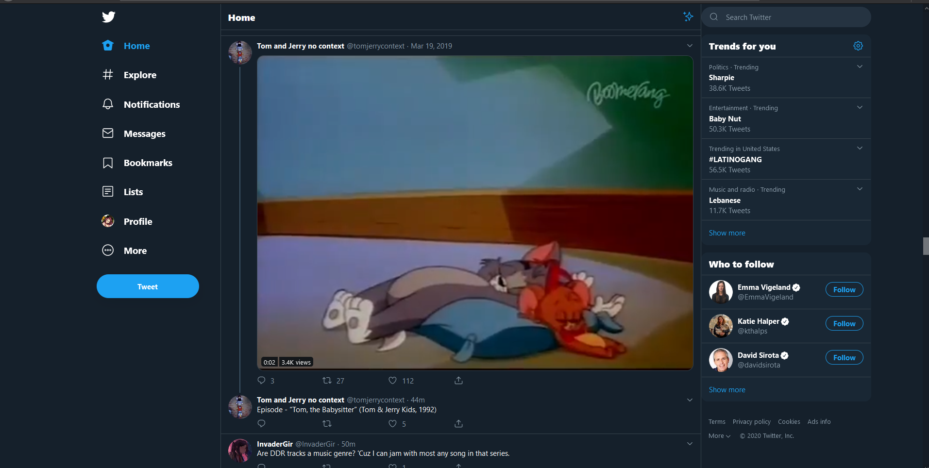
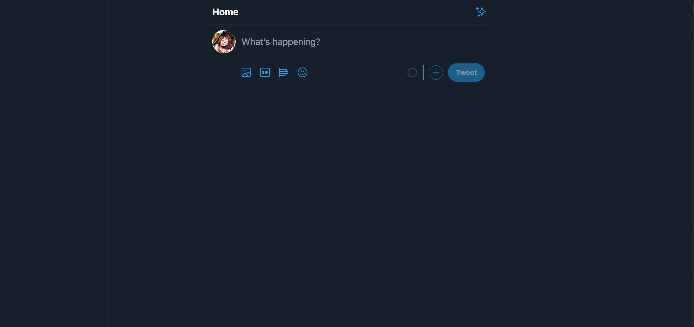
This is a very basic change, I have reduced the whitespace of the navebar on the right and on the left to maximize the view of the content. This way, the content is more in the forefront and could be easier to see when on larger displays.
For this assignment, I have decided to create different layouts for the hellish website twitter (dot) com. Currently, I have created some designs for this site. One of the things that I have realized while trying to modify the DOM is the sheer amount of divs that encapsulates most of the HTML. This makes it significantly harder to modify individual elements as it either doesn't do anything or it breaks everything.
This is a very basic change, I have reduced the whitespace of the navebar on the right and on the left to maximize the view of the content. This way, the content is more in the forefront and could be easier to see when on larger displays.
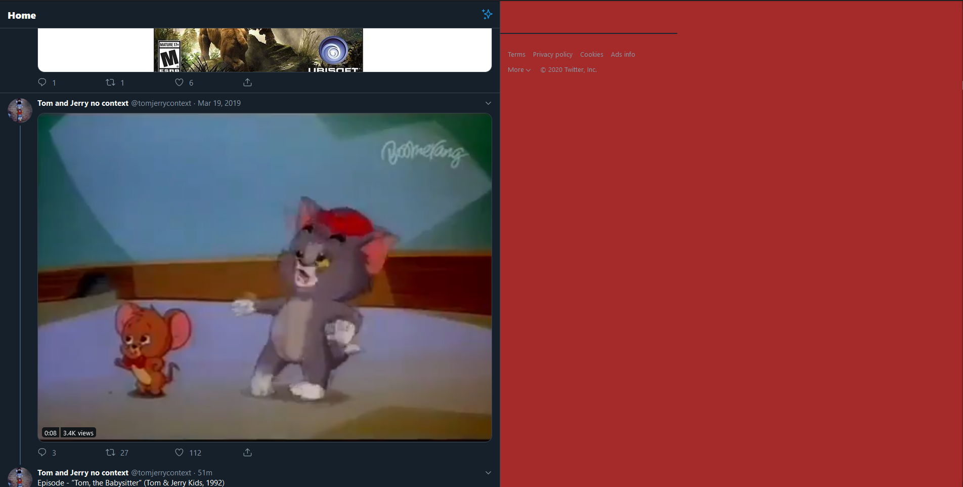
This wasn't the intended result, but it got to a similar goal that I wanted. I removed the trends for you section because I absolutely despise looking
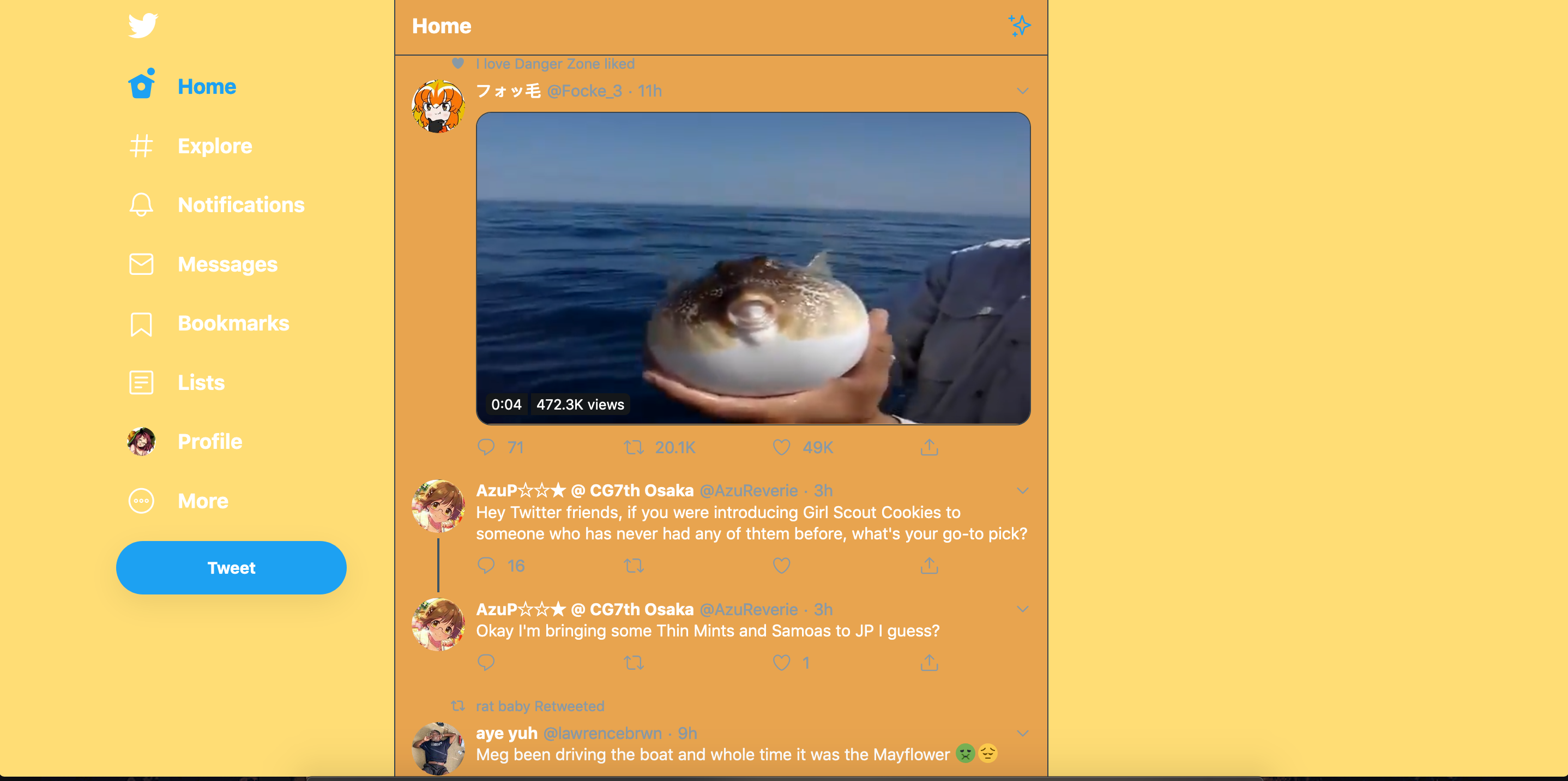
I like the colors, so I chose this design. There should be more liberty to change how your twitter is displayed, similar to Tumblr. I also removed the trendings because I hate it.
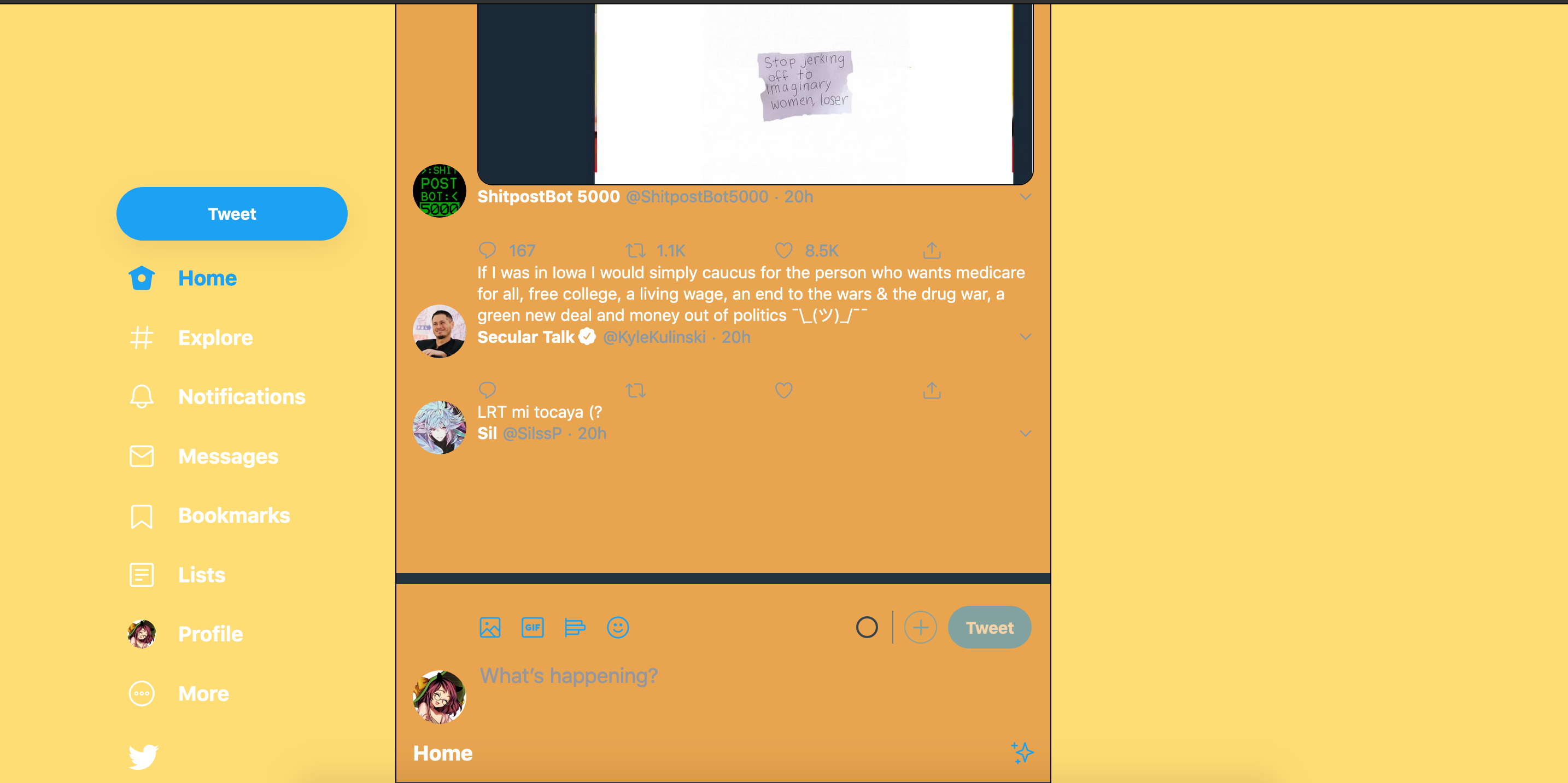
This is more of an interactive experience, but what I switched the flow direction so that it was reversed. What this resulted was the oldest contest constantly appearing, until it froze and broke. I like it.
Content but instead of everyone seeing each others content, you simply scream into the aether. Maybe someone will read what you wrote when they access the database, but otherwise, they won't.
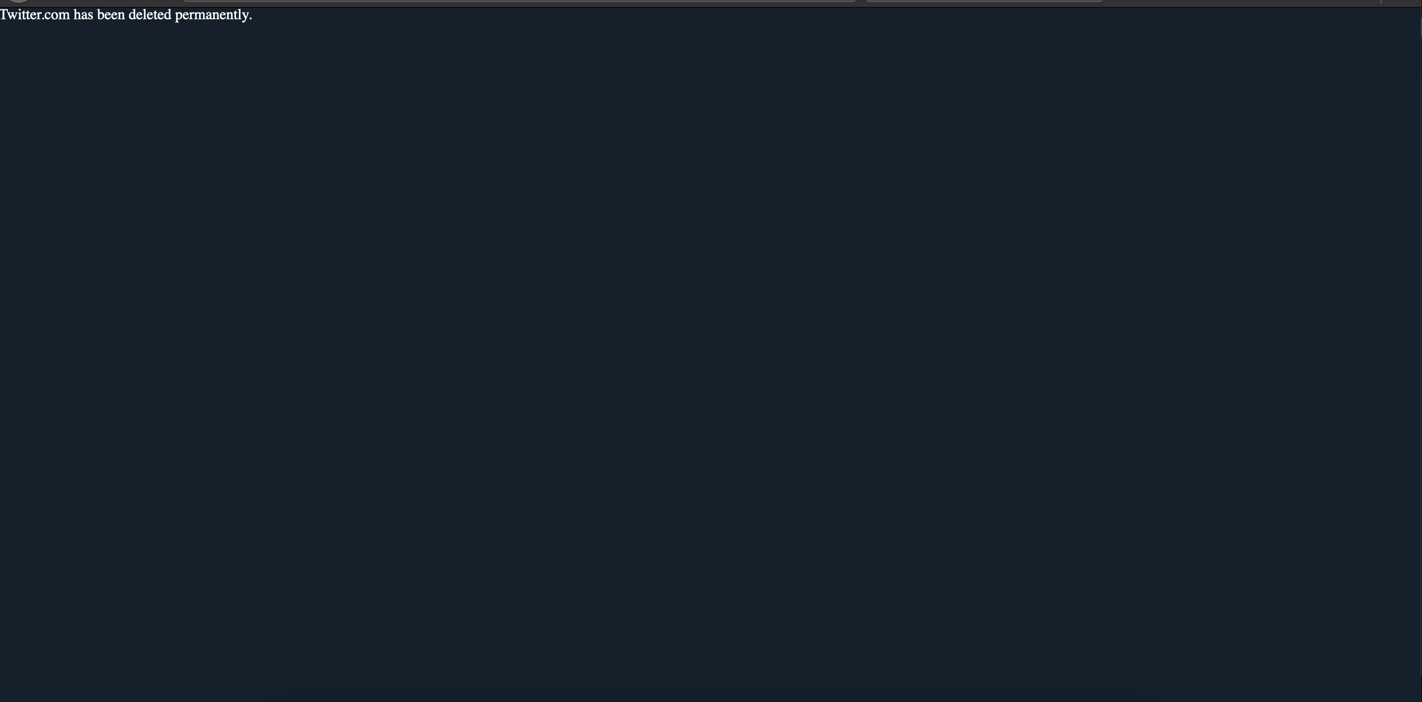
Twitter is gone. Now everyone is free and can feel liberated.